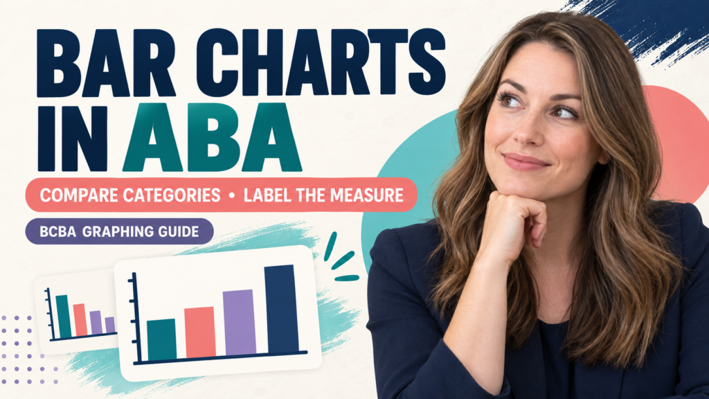
Are bar charts used in ABA? Yes—when the question is to compare separate categories or summary values on a common scale. A bar chart is usually not the best primary display when you need to see how behavior changes session by session. For repeated observations across time, an equal-interval or other time-series display usually preserves more of the information that a BCBA needs.
Table of Contents
- Are Bar Charts Used in ABA?
- When Should You Use a Bar Chart?
- What Must You Label Before Drawing the Bars?
- How Is a Bar Chart Different From Other ABA Graphs?
- What Does an ABA Bar-Chart Example Show?
- What Can a Bar Chart Hide?
- How Are Bar Charts Tested on the BCBA Exam?
- ABA Bar-Chart Checklist
- Take the Free BCBA Mock Exam
The chart type should follow the decision, not the other way around. Before drawing a bar, ask whether the categories are genuinely separate, whether the values use the same measure and denominator, and whether the order of observations matters. A polished graphic can still mislead if it hides missing sessions, changes the measurement system, or turns a summary into a causal conclusion.
This guide focuses on graph selection for study and professional communication. Use fictional or de-identified examples, follow your supervisor-approved measurement system, and check the current BCBA Test Content Outline for the exam context. A graph is a display of data—not a substitute for an operational definition, reliable measurement, or clinical judgment. Table of Contents
Are Bar Charts Used in ABA?
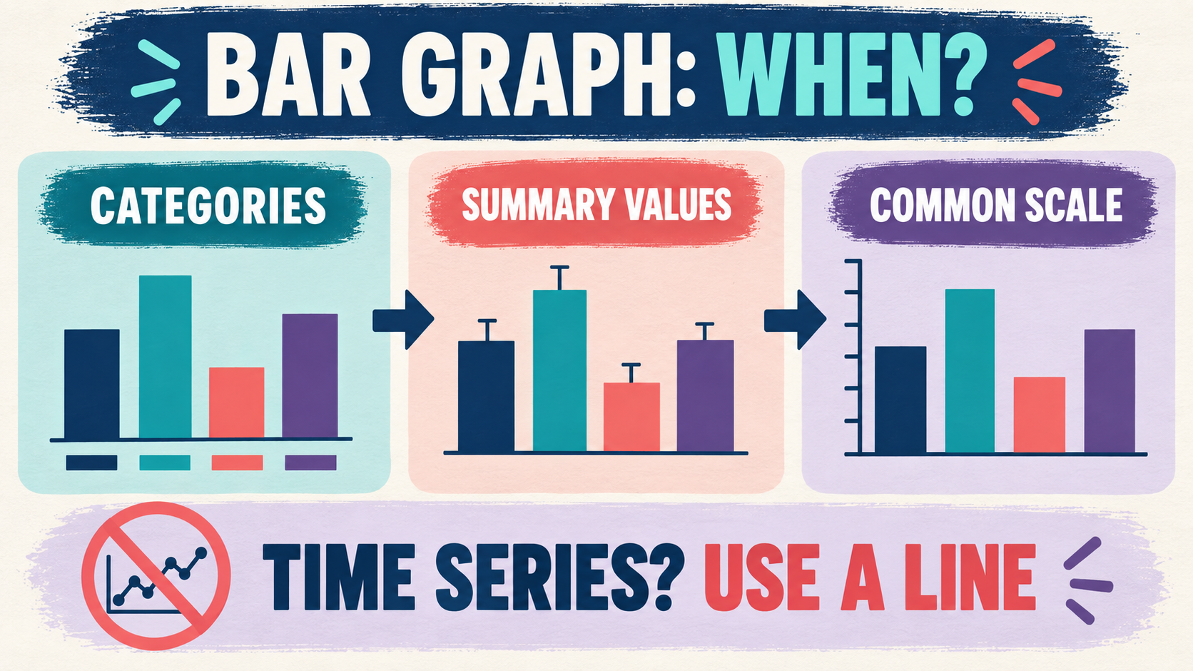
Yes. A bar chart can be useful when the reader needs to compare discrete categories, settings, response forms, conditions, or summary values. For example, a team might compare the percentage of opportunities completed independently across four communication modes during one defined probe. The bars make the category comparison quick to see.
The important limitation is that a bar chart compresses information. If you combine several sessions into one bar for “baseline” and another for “intervention,” the display may hide the order of sessions, variability, a delayed change, or a phase in which the procedure was not implemented consistently. That summary might be useful for a narrow question, but it is not a replacement for the underlying time-series record.
In BCBA exam language, do not choose a graph because it looks simple. Identify the quantitative relation the question asks you to communicate. “Which setting had the highest average?” points toward a category comparison. “How did the target change after the intervention across sessions?” points toward a time-series display.
When Should You Use a Bar Chart?
Use a bar chart when all of the following are true:
- The categories are meaningful. Each bar represents a defined group, setting, response form, condition, or summary period—not an arbitrary slice of a continuous sequence.
- The measure is consistent. Every bar uses the same dimension, such as count, rate, percentage, mean duration, or a clearly defined score.
- The denominator is comparable. If the bars show percentages or rates, the reader can tell what opportunities or observation time produced each value.
- Time order is not the main question. The purpose is comparison, not visual analysis of change from session to session.
- The scale is honest. The axis, units, zero point, labels, and rounding do not exaggerate a small difference.
Common ABA uses include comparing summary results from a preference assessment, showing the distribution of response forms during a defined sample, comparing accuracy across task components, or displaying the percentage of records that meet a stated quality rule. The right choice depends on the question and the design, not on a universal rule that all ABA data must be shown with one graph type.
What Must You Label Before Drawing the Bars?
A bar’s height is only interpretable when the reader knows what it measures. Before graphing, write down the numerator, denominator, unit, observation period, category definition, and treatment of missing opportunities. If you cannot explain those fields in one sentence, the display is not ready.
| Graph field | Question to answer | Example |
|---|---|---|
| Measure | What does the bar height represent? | Independent responses as a percentage of opportunities |
| Denominator | Percentage or rate of what? | Correct independent responses ÷ valid opportunities |
| Category | How is each bar different from the others? | Requesting, labeling, AAC selection, and gesture |
| Period | Which observations were summarized? | A pre-specified 10-opportunity probe on one date |
Keep the underlying data available. If two categories both show 80%, the reader may need to know whether one came from 8 of 10 opportunities and the other from 40 of 50. Equal percentages do not always carry equal precision or the same practical weight.
How Is a Bar Chart Different From Other ABA Graphs?
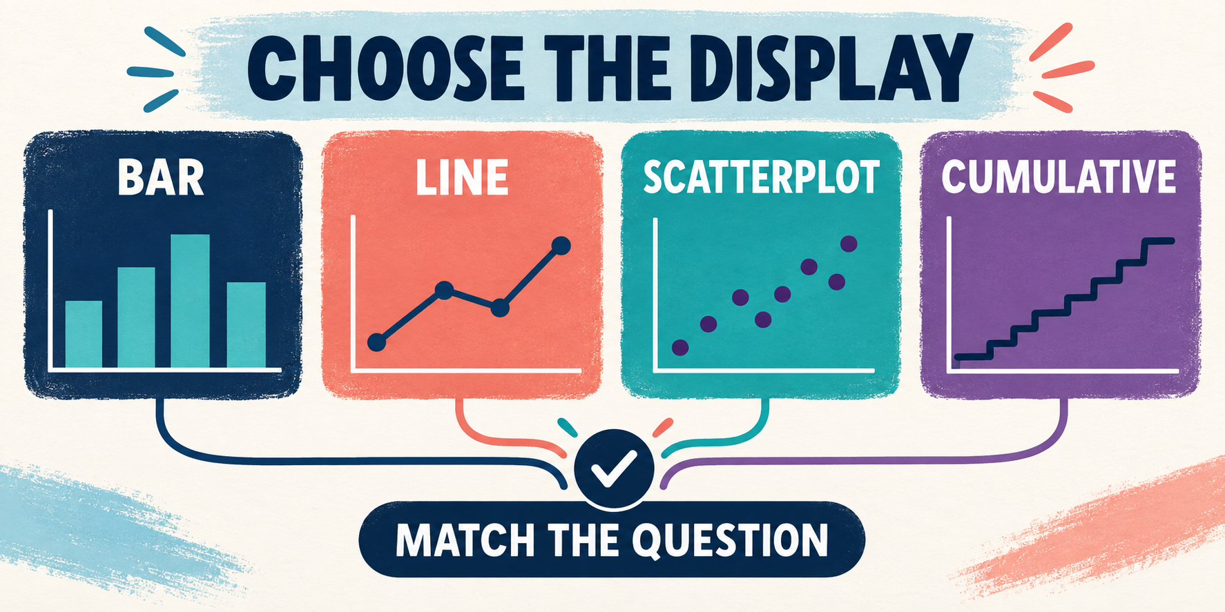
Graph types answer different questions. The names matter less than the relation between the data and the decision.
| Display | Best first question | Main caution |
|---|---|---|
| Bar chart | How do separate categories or summaries compare? | It can hide sequence, variability, and within-category data. |
| Equal-interval line graph | How does behavior change across ordered observations or phases? | It requires meaningful time or session order and consistent measurement. |
| Scatterplot | Does behavior cluster in relation to time, setting, or another variable? | A pattern is not automatically a causal relation. |
| Cumulative record | How does the total number of responses accumulate over time? | The slope and cumulative total answer a different question from category comparison. |
These displays can coexist. A team might retain a line graph for ongoing treatment decisions and add a bar chart for a presentation that compares average performance across settings. The summary should never replace the source display when the order, variability, or phase changes matter.
What Does an ABA Bar-Chart Example Show?
Imagine a fictional training team reviews one defined probe with four response forms. The percentages of independent responses are 60% for requesting, 80% for labeling, 50% for AAC selection, and 70% for gesture. A bar chart can make the category comparison visible: labeling is highest in that probe, while AAC selection is lowest.
That conclusion is narrow. It does not show whether performance improved from last week, whether one category had more opportunities, whether the response forms were equally difficult, or why the difference occurred. It also does not establish that one teaching procedure caused a change. To answer those questions, the team needs the relevant time-series data, definitions, context, and design.
- Put the category names on the axis or directly under the bars.
- State whether the values are counts, rates, percentages, averages, or another measure.
- Show the denominator or observation time when it affects interpretation.
- Keep the scale and units consistent across categories.
- Pair the summary with a short text conclusion and the underlying table when precision matters.
What Can a Bar Chart Hide?
A bar chart can hide a lot when summaries are created too early. A mean can conceal an unusual high or low value. A percentage can conceal different opportunity counts. A “baseline” bar can mix sessions with different definitions or observers. A category label can conceal that two settings were not actually comparable. Ask four audit questions before interpreting:
- What was measured? Check the operational definition and dimension.
- How was it measured? Check observation length, opportunity rules, observer training, and missing-data treatment.
- What was combined? Identify the sessions, people, settings, or response forms inside each bar.
- What decision is being made? If the decision depends on change over time, keep the time-series graph visible.
Good visual communication is not about making the chart more decorative. It is about making the relation accurate, readable, and appropriate to the people who will use the information.
How Are Bar Charts Tested on the BCBA Exam?
Exam questions may describe a graph, a data table, or a communication goal and ask which display fits. Use a three-step process:
- Name the decision: category comparison, change over time, accumulation, or possible time-of-day pattern.
- Identify the measure: count, rate, percentage, duration, latency, or another dimension.
- Reject the overclaim: a bar chart can summarize values, but it does not prove a functional relation or a treatment effect by itself.
Watch for distractors that use a bar chart because there are only two conditions, or that use a line graph simply because the data are behavioral. The number of bars or lines is not the deciding rule. The question is whether the display preserves the relation the reader needs to see.
- “Compare four settings during one probe”: a bar chart may fit if the measure and denominator are comparable.
- “Show sessions before and after an intervention”: an ordered time-series display usually fits better.
- “Find when behavior occurs during the day”: consider a scatterplot or another display designed for temporal patterns.
- “Show total responses accumulating”: consider a cumulative record.
ABA Bar-Chart Checklist
Before using a bar chart in a study answer, report, or presentation, ask:
- Are the bars real categories rather than arbitrary pieces of a time sequence?
- Does every bar use the same operational definition and measurement dimension?
- Is the numerator, denominator, unit, and observation period clear?
- Would a line graph, scatterplot, or cumulative record preserve the main relation better?
- Does the conclusion stay within what the summary can support?
For additional practice separating data displays and measurement decisions, use the free BCBA mock exam as an independent study aid. It is not official BACB guidance and does not replace a supervisor-approved data system. The direct answer is simple: bar charts are used in ABA when categories or summary values need comparison. If the study question asks, “are bar charts used in ABA,” answer yes—but explain the category-comparison boundary. Preserve the measure, denominator, context, and time-series evidence whenever the decision depends on change over time.
Take the Free BCBA Mock Exam
When you are ready to apply the idea, use the free practice resource below for additional feedback. Take the Free BCBA Mock Exam