What Is a Scatter Plot? (Definition in Applied Behavior Analysis)
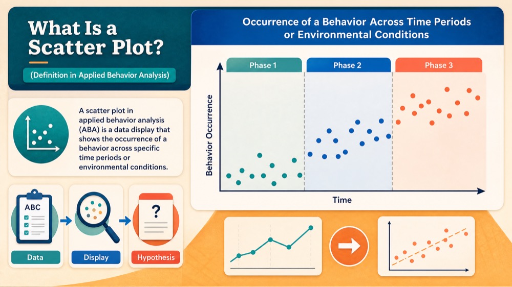
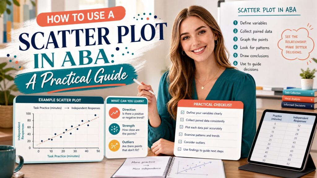
A scatter plot in applied behavior analysis (ABA) is a data display that shows the occurrence of a behavior across specific time periods or environmental conditions. Each data point represents one instance of the behavior, plotted on a grid where the x-axis typically represents time (e.g., 30-minute intervals throughout the day) and the y-axis represents the number of occurrences or simply marks that the behavior occurred.
Table of Contents
- What Is a Scatter Plot? (Definition in Applied Behavior Analysis)
- How to Construct a Scatter Plot: Step-by-Step Guide
- Interpreting Scatter Plots: Identifying Patterns
- Scatter Plot Examples with ABC Analysis
- Scatter Plot on the BCBA Exam: What to Expect
- Quick Checklist for Scatter Plot Mastery
- Take the Free BCBA Mock Exam
- References
Scatter plots are particularly useful in functional behavior assessments because they reveal temporal patterns that might correlate with environmental events. Unlike line graphs that emphasize trends over sessions, scatter plots focus on distribution and density, making it easier to see when a behavior is most likely to occur. For the BCBA exam, you need to know not only how to read them but also when to recommend them.
Key Components of a Scatter Plot: To interpret a scatter plot accurately, you must identify its fundamental parts. The x-axis is divided into equal time intervals, such as 15-minute, 30-minute, or 1-hour blocks. The y-axis may show the frequency count or simply indicate whether the behavior occurred at least once during that interval. Each dot or mark on the grid represents one observed occurrence.
Scatter plots can also include condition lines to separate different phases (e.g., before and after an intervention). When analyzing a scatter plot, pay close attention to clusters of dots, empty spaces, and the overall shape. These visual cues guide hypothesis development about what might be triggering or maintaining the behavior. How a Scatter Plot Differs from Other Graphs: In ABA, you will encounter various graphing methods, each serving a distinct purpose. Here are key differences:
- Line graphs display data over time to show trends and level changes; they are ideal for intervention effects.
- Bar graphs compare discrete categories, such as the number of behaviors across different settings.
- Cumulative records show total count over time with a consistently increasing slope; useful for rate of responding.
- Scatter plots emphasize the distribution of individual occurrences across time, making them the best choice for detecting temporal patterns and potential correlations with activities or people.
When a behavior seems to happen only during specific periods, such as mornings or during certain academic tasks, a scatter plot is your go-to tool. This distinction is a common exam question: “Which graph would you use to identify temporal patterns?”
How to Construct a Scatter Plot: Step-by-Step Guide
Building a scatter plot is straightforward, but it requires careful planning to ensure accurate data. Create a grid with hours or 30-minute blocks across the columns and days of the week down the rows (or vice versa). For each observation interval, place a dot if the behavior occurred. Here is a step-by-step approach:
Step 1: Define the Behavior and Measurement. Write a precise operational definition so observers agree on what counts as an occurrence. Choose a measurement system, such as frequency or duration, and a recording method (e.g., interval recording).
Step 2: Determine Time Intervals. Select the length of each interval based on the behavior’s frequency and the environmental events you want to see. For example, if tantrums occur several times per hour, 15-minute intervals may be better than 60-minute blocks.
Step 3: Plot the Data. For each interval, mark a dot if the behavior occurred at least once. If the behavior did not occur, leave the cell empty. Some practitioners prefer to count the number of occurrences per interval and write that number in the cell, but a simple dot is common.
Remember that scatter plots are typically used during descriptive assessments (e.g., A-B-C data collection). They help you formulate hypotheses, but they do not confirm function. For the exam, you should be ready to describe the steps and recognize why each is important.
Interpreting Scatter Plots: Identifying Patterns
Once you have collected several days of data, it is time to analyze the scatter plot for patterns. Look for clusters of dots, gaps, or times when the behavior consistently occurs. These patterns often align with environmental events such as transitional times, particular teachers, or specific demands. Common Patterns to Look For: When reviewing a scatter plot, focus on these aspects:
- High-density clusters indicate periods when the behavior occurs frequently.
- Consistent gaps suggest times when the behavior rarely or never happens, which may be equally informative.
- Trends across weeks may show a new pattern emerging after a change in routine.
- Relationship to specific activities (e.g., math class, lunch) can point to antecedent variables.
These patterns do not prove a functional relation, but they do create a roadmap for further assessment. For example, if aggression consistently occurs during transitions, you might investigate what happens during those transitions and consider functional behavior assessment methods.
Connecting Patterns to Behavioral Hypotheses: Interpretation links the scatter plot data to behavioral function. If the behavior peaks during independent work and rarely occurs during play, you might hypothesize that the behavior is maintained by escape from demands. If it spikes when attention is diverted away, the hypothesis could be attention-maintained. These hypotheses later guide the selection of functional analysis conditions or intervention strategies.
On the exam, you may be asked: “Based on this scatter plot, what is the most likely function?” You must use the context of the time periods and any ABC notes to make a reasoned choice. Always remember: scatter plots show correlation, not causation; they are a starting point, not a definitive answer.
Scatter Plot Examples with ABC Analysis
To solidify your understanding, let’s walk through two worked examples that combine scatter plot patterns with ABC (Antecedent-Behavior-Consequence) data. Example 1: Attention-Maintained Behavior: Scenario: A 7-year-old child shouts out during independent reading time but rarely during teacher-led instruction. The scatter plot shows most data points during the 10:00–10:30 AM block, which is silent reading.
ABC data for one occurrence: Antecedent: The teacher is working with another student; Behavior: The child shouts the teacher’s name; Consequence: The teacher looks up and says, “Remember to work quietly.” The hypothesized function is attention from the teacher. The scatter plot pattern aligns with that hypothesis because the behavior occurs only when attention is unavailable. Example 2: Escape-Maintained Behavior: Scenario: A teenager displays aggression during difficult math assignments but not during preferred activities. The scatter plot shows a cluster during the 2:00–2:45 PM math period.
ABC data: Antecedent: The teacher presents a multi-step math problem; Behavior: The student throws the pencil and pushes the worksheet away; Consequence: The teacher removes the task and sends the student to the office. The function is escape from demands. The scatter plot clearly indicates the times associated with high demands. These examples are typical of exam questions where you are given a scatter plot and an ABC narrative. Practice identifying which time blocks are relevant and linking them to the function.
Scatter Plot on the BCBA Exam: What to Expect
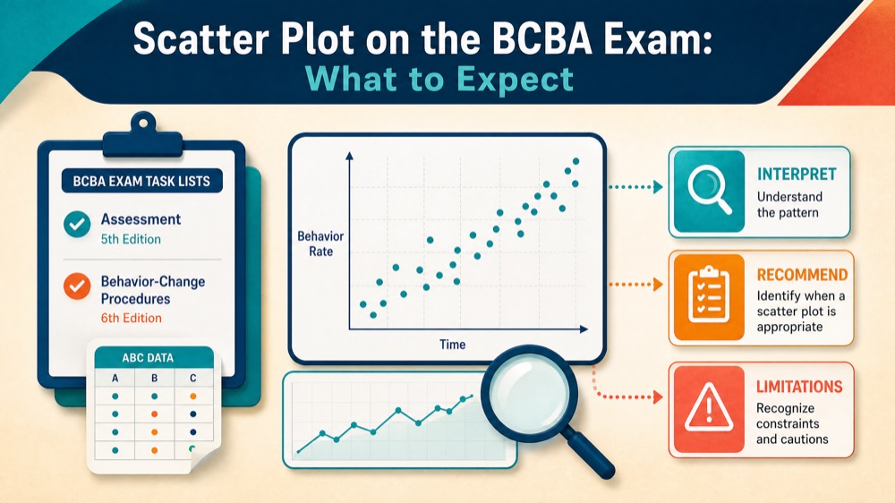
Scatter plots appear in the “Assessment” and “Behavior-Change Procedures” content areas on the BCBA exam (5th and 6th edition Task Lists). You may be tested on your ability to interpret them, recommend them, or identify their limitations.
Understand the BACB task list items that relate to data collection and analysis. For instance, you should know that scatter plots are part of the descriptive assessment toolbox, alongside ABC narrative recording and checklist observations. They are not used for demonstrating experimental control; that requires a functional analysis. Common Exam Traps and How to Avoid Them: Many candidates miss points due to simple mistakes. Watch out for these:
- Misreading axes: Be sure you know which variable is on each axis. The x-axis is almost always time/condition, and the y-axis is the behavior metric.
- Assuming causation: Scatter plots only show correlations. Never say the scatter plot proves the function of the behavior.
- Confusing with line graphs: Scatter plots are not used to show trends across sessions; they show patterns within sessions.
- Ignoring context: Always use ABC data and other information to interpret the scatter plot; do not rely solely on the visual.
To strengthen your skills, practice interpreting multiple scatter plots with variable patterns. Ask yourself: “What environmental event coincides with these clusters?” This habit will prepare you for scenario-based questions.
Quick Checklist for Scatter Plot Mastery
Use this checklist to review the key points before your exam:
- Define the target behavior with an operational definition before data collection.
- Choose time intervals that match the behavior’s frequency and environmental events.
- Construct the scatter plot with clear axes and consistent marking.
- Analyze clusters, gaps, and patterns related to specific times or activities.
- Develop hypotheses about behavioral function based on patterns and ABC data.
- Remember that scatter plots are descriptive, not experimental; they support but do not confirm function.
- Review your interpretation with the exam’s Task List items in mind.
Also, read our guide on continuous measurement to see how scatter plots fit with other data collection methods. By mastering scatter plot construction and interpretation, you are building a crucial skill for both exam success and applied work. Keep practicing with sample graphs, and you will approach these questions with confidence.
Take the Free BCBA Mock Exam
Ready for more practice? Use the free mock exam to keep testing your accuracy with realistic BCBA-style items. Take the Free BCBA Mock Exam
References
Next step for BCBA exam prep
Turn this topic into exam-day practice
Use this topic as a focused review, then test it in exam-style conditions with a free mock before deciding whether five full-length mocks are the right next step.
Start the Free BCBA Mock Exam
Continue with Five Full-Length Mocks — $99
Review the included materials and access details before ordering. No pass guarantee is implied.