
If you are looking for the cumulative graph meaning in ABA, start with one idea: the graph shows a running total. Each new count is added to the total that came before it. A line can rise when responses accumulate and stay flat when no new responses are added, but it should not move downward within one uninterrupted cumulative record.
Table of Contents
- Cumulative Graph Meaning in ABA
- How a Cumulative Record Is Built
- How to Read Level, Slope, and Plateaus
- When to Choose a Cumulative Graph
- Cumulative Record vs. Other ABA Graphs
- Common Cumulative Graph Interpretation Errors
- BCBA Exam Takeaways
- Frequently Asked Questions
- Take the Free BCBA Mock Exam
- Practice Graph Interpretation
- References
The practical question is not simply “Does the graph go up?” It is “What is being accumulated, over what time or sequence, and what does the slope tell me about response rate?” A cumulative graph can show the total number of responses, skills, or events while making the speed of accumulation visible. It is useful when the total and rate matter more than the exact session-by-session up-and-down pattern.
Cumulative Graph Meaning in ABA
A cumulative graph, also called a cumulative record, displays the accumulated count of a response across successive observation periods. The current value includes the prior values. If a learner emits 3 responses in the first session, 4 in the second, and 2 in the third, the cumulative values are 3, 7, and 9. The graph does not show “4” as the second point because the second point includes the first session’s three responses. This display answers two related questions:
- How many responses have accumulated? Read the vertical value at a particular point.
- How quickly are responses accumulating? Read the slope of the data path over a defined interval.
The current BCBA Test Content Outline places cumulative records within data display and interpretation. For exam questions, do not confuse the running total with a daily frequency graph. A cumulative graph can make progress look steadily upward even when the number of responses per session changes substantially.
How a Cumulative Record Is Built
Build the graph from a clearly defined count. First specify the response or unit being accumulated, the observation period, and the rule for adding a value. The unit might be the number of mands, new words learned, completed task-analysis steps, or another event that can be counted consistently. If the unit changes halfway through the display, the accumulated line no longer represents one interpretable measure.
- Define the event. State what counts as one response or one mastered unit.
- Collect the count for each period. Keep the session, observation window, or learning opportunity consistent enough to interpret.
- Add each new count to the previous total. The first cumulative value equals the first period’s count.
- Plot the running total in sequence. The horizontal axis represents the order or time periods; the vertical axis represents the accumulated count.
- Inspect the slope and plateaus. A steep segment indicates faster accumulation; a flat segment indicates no added responses during that interval.
For example, suppose the raw counts across six sessions are 3, 4, 4, 0, 4, and 5. The cumulative values are 3, 7, 11, 11, 15, and 20. The line stays flat during the fourth session because the count added during that period is zero. It does not fall to zero. That flat segment is meaningful: it shows no new accumulation during that interval while the prior total remains visible.
How to Read Level, Slope, and Plateaus
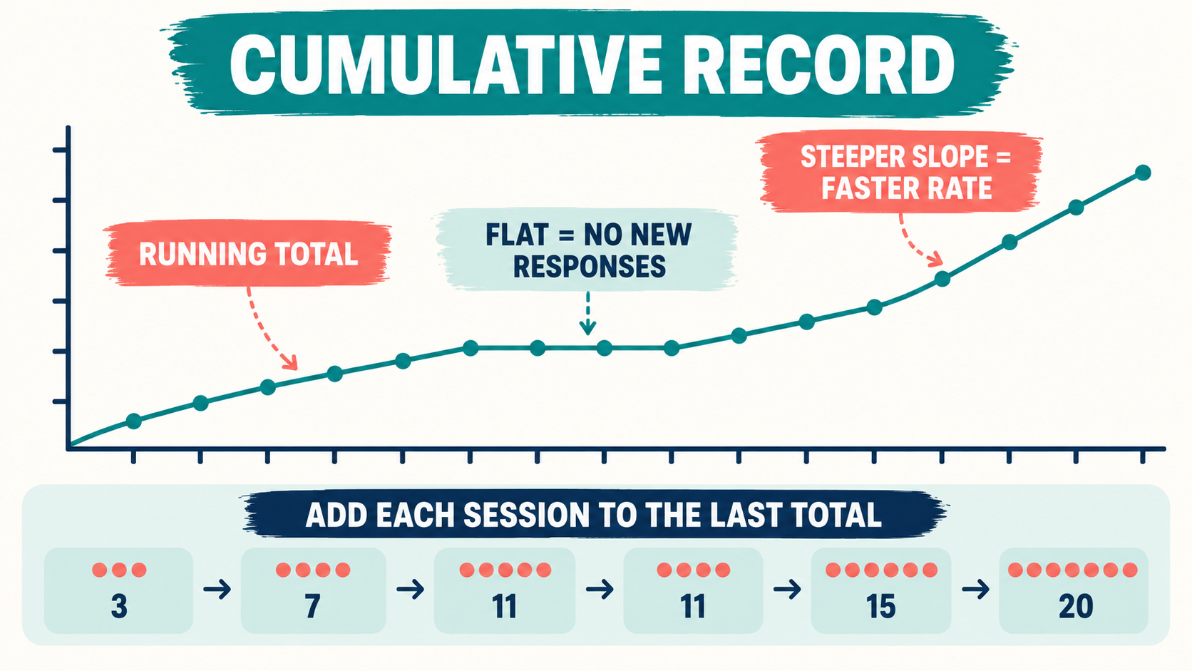
The level is the accumulated value at a point. It tells you how much has been counted so far. If the line ends at 20, the record represents a total of 20 accumulated units at the end of the displayed series. Level is different from the number of responses in the most recent session.
The slope shows the rate at which the total is increasing across an interval. A steeper slope means the count is accumulating faster. A shallow slope means responses are accumulating more slowly. A flat segment means that no new units were added during that interval. The slope is therefore a visual estimate of rate; it does not automatically tell you why the rate changed.
Use the environmental and procedural context before attributing a slope change to an intervention. A steeper line might reflect an effective teaching procedure, more opportunities, a different response definition, longer observation periods, or better implementation. A plateau might reflect a true absence of new responses, a mastered ceiling, an interrupted session, or a measurement problem. The graph communicates the quantitative relation; the design and documentation provide the context for interpretation.
| Visual feature | What it tells you | What it does not prove |
|---|---|---|
| Higher level | More units have accumulated by that point. | That the recent session had the highest response rate. |
| Steeper slope | The total is increasing more quickly over the selected interval. | That one intervention caused the change without design and fidelity evidence. |
| Flat segment | No new units were added during that interval. | That the prior accumulated total disappeared or was lost. |
When to Choose a Cumulative Graph
Choose a cumulative graph when the total accumulation and the rate of accumulation are central to the question. Common examples include counting new skills acquired, response totals that are expected to accumulate, or a behavior for which the slope is clinically informative. A cumulative record can be especially clear when the response cannot be “undone” within the defined series, such as a new target mastered or a total number of responses emitted.
It is less useful when the main question is how performance changes from one session to the next, whether the behavior decreases during treatment, or how different categories compare at one point. In those cases, a line graph, equal-interval graph, or bar graph may communicate the relation more directly. Graph choice should follow the measurement question, not a preference for a familiar template. Before choosing the display, ask:
- Is the target a count that can be added across periods without changing its meaning?
- Do I need to see the running total, the rate, the session-by-session value, or category differences?
- Will a cumulative display hide a decrease or make treatment effects harder to see?
- Are the observation periods and response definitions comparable?
- Will the intended reader understand what the level and slope represent?
Cumulative Record vs. Other ABA Graphs
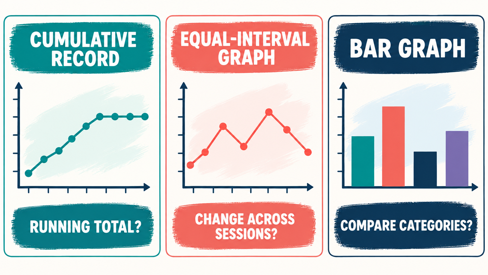
The phrase “cumulative graph” describes one display logic, not the only valid way to show ABA data. An equal-interval line graph plots the value for each interval so the path can rise or fall. A bar graph compares separate categories or discrete values. A cumulative record adds each new count to the prior total, so the line remains level or rises during a continuous series.
| Graph type | Best fit for | Key visual rule |
|---|---|---|
| Cumulative record | Running totals and response-acquisition rate. | The path stays flat or rises within one uninterrupted series. |
| Equal-interval line graph | Changes in a value across sessions or intervals. | The path may rise or fall because each point is the interval value. |
| Bar graph | Comparing categories, conditions, or separate summary values. | Each bar represents its own category or value rather than a running total. |
For broader review, the site’s ABA graphing and visual-analysis guide covers level, trend, variability, and common exam errors. The cumulative graph meaning page should remain the focused resource for running totals, slope, plateaus, and display selection.
Common Cumulative Graph Interpretation Errors
- Reading the second point as the second session’s count: the point is the previous total plus the new count.
- Expecting the line to return to zero: a zero count creates a plateau, not a downward reset.
- Calling a high endpoint a high recent rate: endpoint level and recent slope answer different questions.
- Ignoring unequal observation periods: a longer observation window can add more responses without a true rate improvement.
- Resetting without labeling the series: a new origin or phase must be clearly identified; otherwise the reader may misinterpret the display.
- Using cumulative data to hide decreases: when reduction across sessions is the central question, a cumulative path may be the wrong display.
- Inferring causation from slope alone: examine the design, phase changes, treatment fidelity, and competing explanations.
BCBA Exam Takeaways
On a BCBA exam question, identify the measurement unit and the display rule before interpreting the line. If each point includes all prior responses, you are looking at a cumulative record. A rising line does not necessarily mean the rate is constant; the slope can become steeper, shallower, or flat. A line that falls within what is labeled one cumulative series should prompt you to check whether the graph was reset, the data were entered incorrectly, or the display is not actually cumulative.
- Level answers “How much has accumulated so far?”
- Slope answers “How quickly is the total accumulating over this interval?”
- A plateau means no new units were added while the prior total remains.
- A cumulative record is not the same as a daily frequency or equal-interval line graph.
- Choose the display that makes the intended quantitative relation easiest to see.
- Always inspect the definition, observation window, and phase labels before drawing a clinical conclusion.
Frequently Asked Questions
Can a cumulative graph go down?: Not within one uninterrupted cumulative series if the measure is being added correctly. A flat segment represents zero new accumulation. A downward move usually signals a reset, a new series, data correction, or a graph that is not actually displaying cumulative values.
What does a steep slope mean on a cumulative graph?: A steeper slope means the total is increasing faster over the selected interval. It does not, by itself, identify the cause of the change. Check the number of opportunities, observation duration, phase, response definition, and treatment fidelity before attributing the slope to an intervention.
What is the difference between cumulative frequency and a cumulative record in ABA?: Both involve accumulated values, but context matters. In ABA, a cumulative record commonly displays a running total of responses or acquired units across an ordered series, with slope used as a visual indication of rate. A cumulative-frequency display in statistics may refer to the running count up to a category or boundary. Read the axes and the measurement definition rather than relying on the label alone.
When should I use an equal-interval graph instead?: Use an equal-interval graph when the value for each session or observation period needs to rise or fall visibly. It is often a better fit for treatment reduction, percentage correct by session, latency, duration, or other measures where the interval value—not a running total—is the central question.
Take the Free BCBA Mock Exam
When you are ready to apply the idea, use the free practice resource below for additional feedback. Take the Free BCBA Mock Exam
Practice Graph Interpretation
After reviewing cumulative graph meaning, practice identifying whether a scenario asks for level, trend, variability, rate, or a running total. The free BCBA mock exam provides practice scenarios for graph and measurement decisions. It is not a BACB product, does not guarantee an exam result, and does not replace current official materials or supervision.
References
- Behavior Analyst Certification Board: BCBA Test Content Outline, 6th ed.
- Pass the Big ABA Exam: Cumulative Record
- Finni Health: How to Interpret a Cumulative Record in ABA Practice
- Behavior Analyst Study: Data Visualization in Applied Behavior Analysis