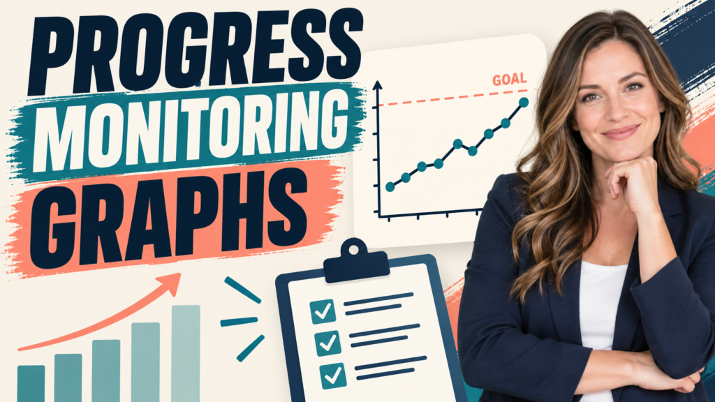
ABA DATA · BCBA STUDY GUIDE Progress monitoring graphs turn repeated observations into a visual record that can help a behavior-analytic team ask a better question: Is the learner’s performance changing enough, in the expected direction, and with enough confidence to justify the next programming decision?
Table of Contents
- What Are Progress Monitoring Graphs in ABA?
- What Should a Progress Monitoring Graph Show?
- How Do You Read Level, Trend, and Variability?
- How Do You Use a Graph to Make a Decision?
- What Makes a Progress Graph Trustworthy?
- Worked Example: When Progress Looks Flat
- What Are the BCBA Exam Takeaways?
- Frequently Asked Questions
- Sources for Further Study
- Take the Free BCBA Mock Exam
What Are Progress Monitoring Graphs in ABA?
A progress monitoring graph displays repeated measurements of a target skill or behavior across time, sessions, opportunities, or phases. The goal is not decoration. The graph makes changes easier to inspect, communicate, and compare with the learner’s goal or decision rule.
In ABA, a graph might display independent requests per session, percentage of steps completed, rate of aggression, duration of task engagement, latency to begin a routine, or another operationally defined measure. The measurement must match the behavior. A line that rises is not automatically improvement; it depends on whether a higher value is desirable for that target.
The current BCBA Test Content Outline places graphing and interpretation within measurement, data display, and interpretation. That means learners need to understand both how to display a relation and how to interpret it cautiously. A graph can show a pattern. It cannot, by itself, establish why the pattern occurred.
What Should a Progress Monitoring Graph Show?
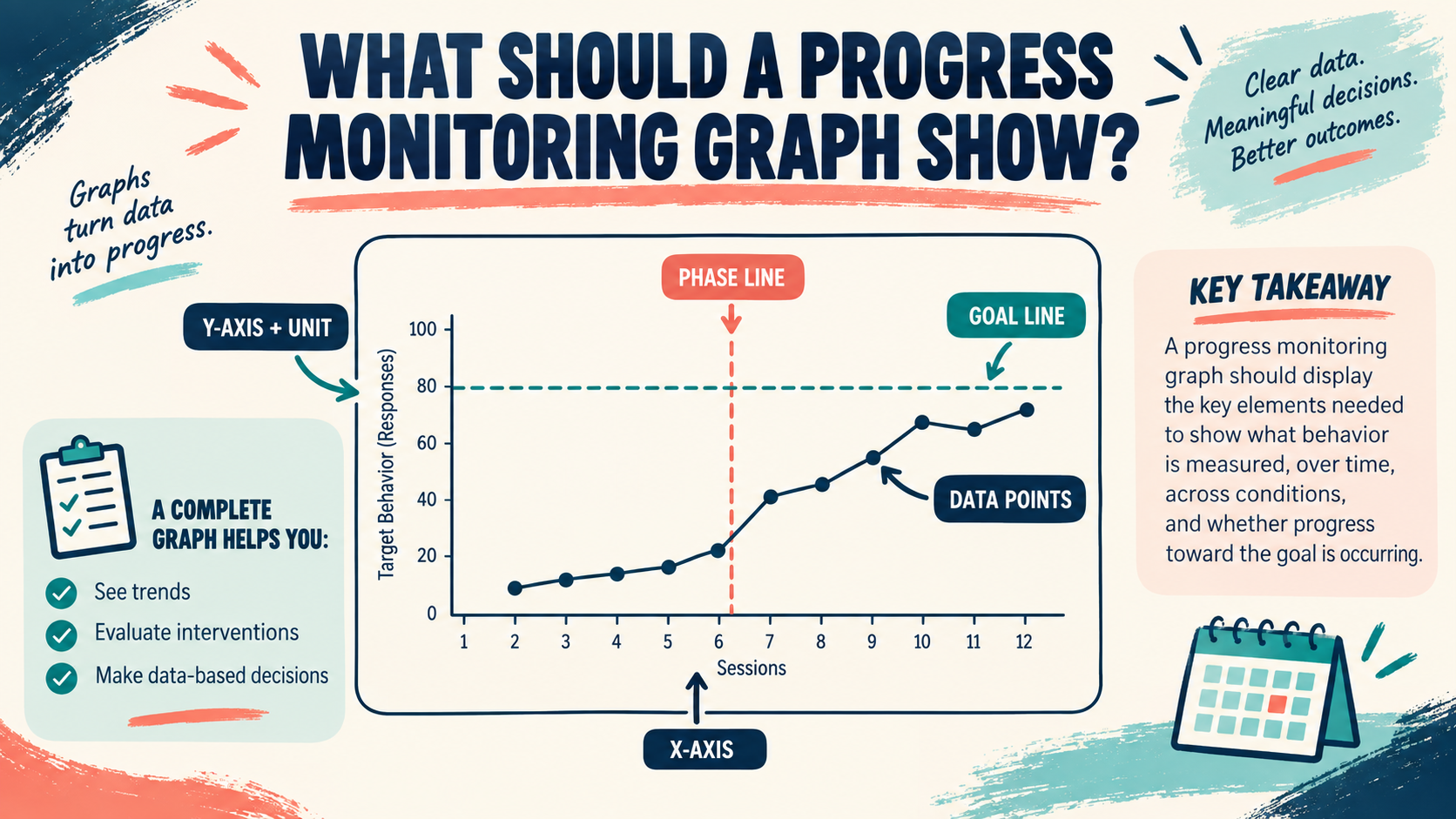
A useful graph answers basic questions before anyone interprets the trend:
- What was measured? Put the operationally defined target and the measurement unit in the y-axis label.
- When was it measured? Use a meaningful x-axis such as session number, date, opportunity, or calendar week.
- Which phase or condition was in effect? Use clear phase labels and vertical phase-change lines when the condition changes.
- What is the goal or criterion? Show a goal line only when the goal is defined and its use will not imply false precision.
- Who can read it? Keep labels, units, legends, and scales understandable to the team and stakeholders who use the data.
| Graph element | Question it answers | Common mistake |
|---|---|---|
| Y-axis label and unit | What dimension and scale were measured? | Writing “behavior” without naming frequency, rate, duration, latency, percentage, or another unit. |
| X-axis | Across what sequence were observations ordered? | Treating irregular dates or missing sessions as if they were evenly spaced without explanation. |
| Phase label and line | When did the condition, intervention, or measurement process change? | Reading a phase change as proof that the new condition caused the change. |
| Data path | What level, direction, and spread do the observations show? | Connecting points or smoothing them in a way that hides variability or missing data. |
How Do You Read Level, Trend, and Variability?
Level is the typical height of the data in a phase. Compare the center of one phase with the center of another, but do not pretend that a few points provide a stable average. Trend is the general direction of the data: increasing, decreasing, or relatively flat. The desired direction depends on the target. More independent communication may be favorable; more episodes of dangerous behavior may not be.
Variability describes how widely the points fluctuate. Two phases can have similar average levels but very different stability. A highly variable series may require more observations, a review of measurement conditions, or a closer look at setting events before a team changes the plan.
Also inspect overlap, immediacy of change, consistency across settings, and the number of observations. A line that appears to improve after a phase change deserves attention, but visual inspection should be paired with the design, measurement quality, procedural integrity, and the client’s meaningful outcome. Do not turn a single upward point into a treatment success story.
How Do You Use a Graph to Make a Decision?
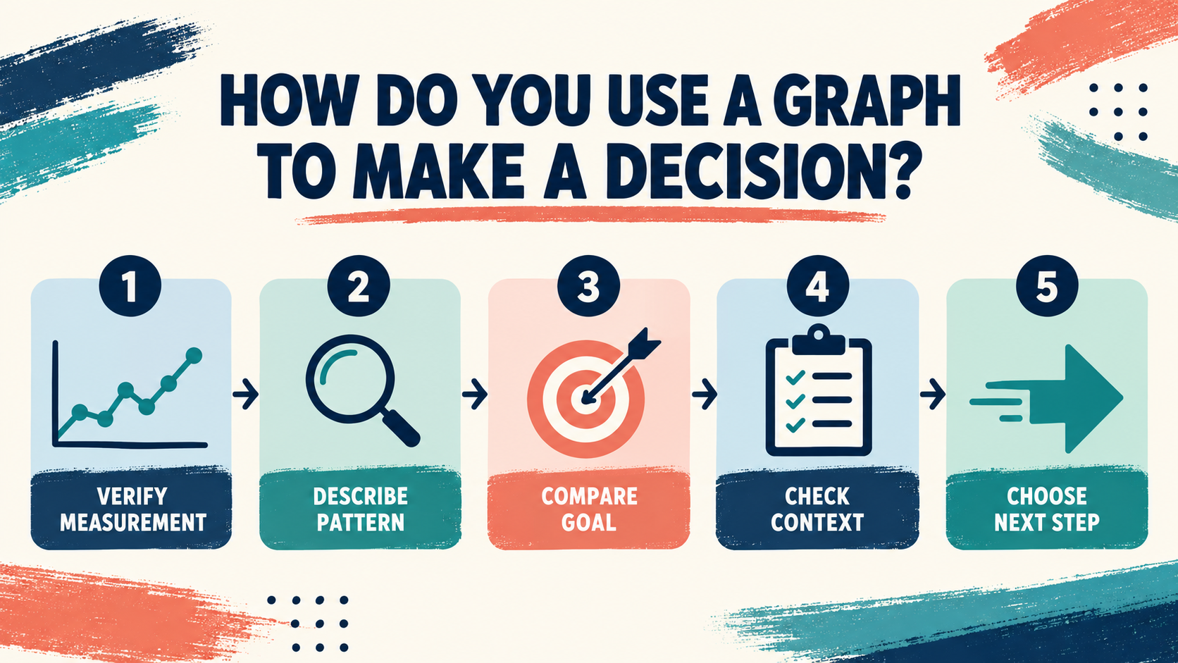
Use the graph as one part of a repeatable decision routine:
- Verify the measurement. Confirm that the same operational definition, unit, observer expectations, and data-collection procedure were used across the points being compared.
- Describe before explaining. State the level, trend, variability, and phase relation without assigning a cause too early.
- Compare with the goal. Ask whether the current performance is approaching the criterion, maintaining it, or moving away from it.
- Check context and integrity. Review attendance, opportunities, setting changes, implementer consistency, dosage, and procedural-integrity information.
- Choose the smallest defensible next step. Continue, collect more information, adjust a component, consult the team, or reassess the target only when the data and the client’s priorities support that choice.
This process prevents a common error: changing an intervention every time the line wiggles. A decision rule can reduce impulsive changes, but it should not replace professional judgment. The rule must be defined before the data are interpreted and should fit the goal, design, risk, and measurement system.
What Makes a Progress Graph Trustworthy?
Graph quality begins before the first point is plotted. An operational definition should make the target observable and measurable. The selected dimension should represent the behavior that matters. Observers need enough training to collect data consistently, and the team should know how missing, duplicated, or questionable observations will be handled.
- Keep raw data available; do not rely only on a manually edited picture.
- Record changes to definitions, observers, settings, materials, or procedures.
- Check agreement or another appropriate reliability indicator when the measurement system calls for it.
- Separate a change in the measurement procedure from a change in the learner’s behavior.
- Use accessible labels and explain the graph in plain language to the people making decisions.
Progress monitoring also has an ethical dimension. A graph should support socially significant, client-informed decisions rather than make a service look successful by selecting a convenient metric. If the plotted target improves while participation, autonomy, safety, or quality of life worsens, the team needs a broader review.
Keep the audience in mind when you present the display. A caregiver may need a short explanation of what the percentage means and what decision the team is considering, while a supervision note may need the exact procedure, phase history, and integrity check. The same underlying data can be communicated at different levels without changing the data or hiding uncertainty.
Worked Example: When Progress Looks Flat
Suppose a learner’s independent requests are measured as a percentage of opportunities across eight sessions. The first four points range from 20% to 35%. After a program change, the next four range from 32% to 38%. A quick glance might suggest improvement, but the series is short and the ranges overlap.
A careful review would describe a modest upward shift with continued variability rather than declare mastery. The team would verify that the number and type of opportunities were comparable, check whether the prompt procedure changed, review whether the learner had access to the same communication response, and compare the current level with the written goal. If the data remain ambiguous, continuing the plan while collecting additional representative observations may be more defensible than making a second change immediately.
Now change the measure: if the target is rate of self-injury, a stable low line may be a meaningful outcome even though it is visually flat. The graph must be interpreted against the goal and the direction of benefit, not against an assumption that every successful graph slopes upward.
What Are the BCBA Exam Takeaways?
For a BCBA question about progress monitoring graphs, first identify what was measured and how. Then look for the answer that uses level, trend, variability, phase changes, measurement validity, and the stated goal together. A graph is a display of data, not a substitute for operational definitions, assessment, experimental control, or clinical judgment.
- Label the behavior, dimension, units, x-axis, phases, and relevant goal.
- Describe the visual relation before making a causal claim.
- Consider variability, overlap, immediacy, replication, and measurement quality.
- Do not confuse a change in the graph with proof that one variable caused the change.
- Choose decisions that are data-based, socially significant, and responsive to client and stakeholder priorities.
If you want a separate study check after reviewing the graphing concepts, the site’s free BCBA mock exam is an independent practice resource. It is not BACB content and does not guarantee a certification outcome.
Frequently Asked Questions
Are progress monitoring graphs the same as functional-analysis graphs?: No. A progress graph can show change in a target over time or across phases. A functional analysis uses a specific experimental arrangement to test relations between programmed conditions and behavior. A progress graph may support clinical review without establishing a functional relation.
Does a higher line always mean improvement?: No. The meaning depends on the target and goal. A higher percentage of independent responses may be favorable, while a higher rate of dangerous behavior may be unfavorable. Read the axis and goal before interpreting direction.
How many data points are enough?: There is no universal number that makes every graph trustworthy. The needed amount depends on the measurement, variability, design, risk, and decision. A short, unstable series should usually be interpreted more cautiously than a longer, representative series.
Sources for Further Study
- BACB BCBA Test Content Outline, 6th edition — measurement, data display, and interpretation competencies.
- BACB Handbook — current fieldwork and unrestricted-activity reference.
- Data-Based Decision Making: The Impact of Data Variability, Training, and Context — peer-reviewed discussion of visual data decisions.
- How accurate are interpretations of curriculum-based measurement data? — research on visual analysis and decision rules.
Take the Free BCBA Mock Exam
When you are ready to apply the idea, use the free practice resource below for additional feedback. Take the Free BCBA Mock Exam