Data and graphing in ABA form the backbone of behavior analysis. Without clear, accurate graphs, even the most carefully designed intervention can be misunderstood or miscommunicated. For Board Certified Behavior Analysts (BCBAs), the line graph is the most common tool for displaying behavior change over time, enabling visual inspection of level, trend, and variability. This practical guide will walk you through creating a line graph step by step, explain other graph types and when to use them, and help you interpret the data patterns that guide decisions. You will also find a worked example, safeguards against misleading graphing, and a study checklist—all grounded in the BACB’s current 6th Edition Test Content Outline.
Table of Contents
- What Is a Line Graph in ABA?
- Step-by-Step Guide to Creating a Line Graph
- Interpreting Line Graphs: Level, Trend, and Variability
- Other Graph Types in ABA: Bar Graphs and Scatterplots
- Common Traps and Safeguards in Graphing
- Study Checklist for Data and Graphing
- Limitations of Visual Analysis
- Free BCBA Mock Exam Practice
Whether you are preparing for the BCBA exam or refreshing your clinical skills, mastering graphing is essential. The BACB’s 6th Edition Test Content Outline includes graphing and visual analysis skills, so you need to be proficient at both constructing and interpreting graphs. But remember, no graph alone proves a functional relationship; you must consider contextual evidence, experimental design, and the totality of the data. This guide will help you think critically about graphing, avoid common mistakes, and use graphs as effective tools for behavior change.
What Is a Line Graph in ABA?
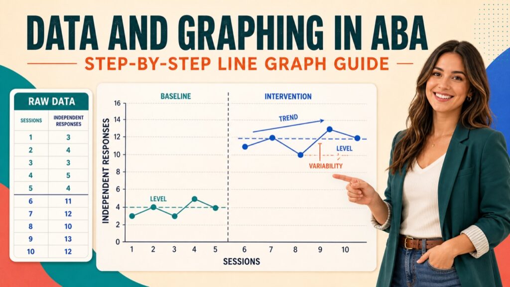
A line graph displays repeated measurements in sequence. The x-axis usually shows sessions, days, or time; the y-axis shows the dependent variable and its unit, such as responses per minute, duration, or percentage. Each point represents one measurement. Lines connecting consecutive points within a condition form the data path, while a vertical phase change line separates changes in conditions.
Use a line graph when order and change over time matter. It makes level, trend, variability, overlap, and immediacy easier to inspect. Interpret the data path within the measurement system and experimental design: a visible change after a phase boundary may support a conclusion, but a graph by itself does not establish a functional relation.
Step-by-Step Guide to Creating a Line Graph
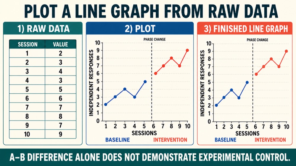
Use this plotting worksheet to turn raw session data into a readable line graph.
- Define the variables: place sessions or time on the x-axis and the measured behavior on the y-axis.
- Label units: write labels such as “Sessions” and “Independent responses per session,” not vague labels such as “Behavior.”
- Set equal intervals: choose a scale that includes every value without exaggerating or hiding change. A zero origin is common but not mandatory; disclose any axis break.
- Plot faithfully: place each value at the correct x-y intersection and use consistent symbols within a condition.
- Draw the data path: connect consecutive points within a phase, but do not connect across a condition change.
- Mark conditions: add a vertical phase change line and label each phase, such as Baseline and Intervention.
- Audit the graph: compare every point with the source data and recheck labels, scale, and phase boundaries.
Worked example: graph independent responses per session. Baseline values for sessions 1–5 are 2, 3, 4, 3, and 5. Intervention values for sessions 6–10 are 6, 7, 8, 7, and 9. Label the axes “Sessions” and “Independent responses per session.” Plot and connect the five baseline points, place a phase change line after session 5, then plot and connect the five intervention points.
The intervention phase has a higher level, a slight increasing trend, moderate variability, and no overlap with baseline. The change appears immediately after the phase boundary. Those features are visually notable, but one A–B comparison does not demonstrate experimental control; replication or an appropriate single-case design is needed before attributing the change to the intervention.
Interpreting Line Graphs: Level, Trend, and Variability
Inspect each phase and then compare adjacent phases using the same definitions.
- Level: the typical magnitude of responding within a phase, estimated visually or with a measure such as the median.
- Trend: the direction and rate of change across time—upward, downward, or approximately flat. A single point does not define a trend.
- Variability: the spread of points around the level or trend. Greater variability can make phase differences harder to interpret.
- Immediacy: how quickly the data change after a condition changes. Compare the last few points of one phase with the first few points of the next.
- Overlap and consistency: examine how much phase distributions overlap and whether similar effects replicate at comparable phase changes.
In the worked example, baseline centers near 3–4 responses and intervention near 7–8, with a modest upward trend in intervention and no overlapping values. This pattern supports a phase difference, not a causal conclusion by itself. Interpret it alongside procedural integrity, contextual variables, and the experimental design. Structured criteria or supplementary statistics may support visual analysis, but they do not replace it.
Other Graph Types in ABA: Bar Graphs and Scatterplots
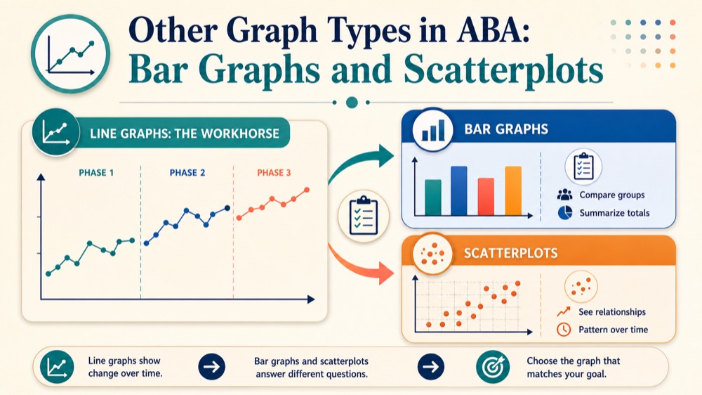
While the line graph is the workhorse of ABA, you should also understand when to use bar graphs and scatterplots. Each graph type serves a distinct purpose, and selecting the right one ensures that your data are communicated effectively.
Bar graphs are best used when you want to compare discrete categories or groups, rather than display changes over time. They are appropriate for summary data, such as average frequency across different conditions or the results of a preference assessment. In a bar graph, the x-axis represents categories (e.g., “Classroom A,” “Classroom B”) and the y-axis represents the value (e.g., “Average instances per hour”). Each bar’s height corresponds to the value for that category. Bar graphs are not ideal for showing trends or within-phase patterns because they do not connect data points over time.
Scatterplots are used to examine the relationship between two continuous variables, often time and behavior occurrence. For example, a scatterplot can show the time of day (x-axis) and the frequency of a behavior (y-axis) to identify patterns in behavior. Each point represents a single observation, and the points are not connected because the goal is to reveal correlations or clusters. Scatterplots are particularly useful during functional behavior assessments to determine if behavior occurs more often at certain times or in certain situations. However, they do not establish causation—they only suggest relationships that need further investigation.
Choosing the right graph type depends on your question. If you are tracking behavior over time to evaluate an intervention, a line graph is almost always the best choice because it displays the data path, level, trend, and variability clearly. Bar graphs are more appropriate for quick comparisons, and scatterplots for exploring patterns. Mastering all three will make you a more versatile analyst.
Common Traps and Safeguards in Graphing
- Misleading scale: equalize axis intervals and avoid a range or aspect ratio that exaggerates or hides change. If an axis is truncated or broken, label it clearly.
- Missing units: name both the measurement dimension and unit on the y-axis.
- Missing condition information: include phase change lines and condition labels, and break the data path at each boundary.
- Inconsistent symbols: use the same symbol for the same data series within a phase.
- Selective plotting: graph every valid observed value; document a missing observation rather than inventing or silently omitting a point.
- Data-entry error: compare plotted coordinates with the source sheet before interpretation or sharing.
A useful safeguard is an independent cold read: ask a reviewer to identify the axes, units, phases, and apparent pattern without explanation. Confusion can reveal a display problem. Preserve the original data, record any justified display adjustment, and separate what the graph shows from what the design permits you to conclude.
Study Checklist for Data and Graphing
- Label the x-axis, y-axis, units, data series, and conditions.
- Use equal intervals and a transparent scale.
- Plot source values accurately and break data paths at phase changes.
- Describe level, trend, variability, immediacy, overlap, and consistency.
- Select a line graph for ordered repeated measures, a bar graph for category summaries, or a scatterplot for possible covariation.
- State the design evidence needed before claiming a functional relation.
Practice by graphing a small raw data set, checking it against the source, and explaining the pattern in one paragraph. The current BACB BCBA Test Content Outline can guide study priorities, but it does not guarantee a specific graphing item.
Limitations of Visual Analysis
- Judgment varies: reviewers can disagree about level, trend, or variability. Structured decision rules and agreement checks can improve transparency.
- Display choices matter: scale, aspect ratio, missing data, and point spacing can change perception even when values do not change.
- Association is not experimental control: history, maturation, procedural changes, or other events may coincide with a phase change. Demonstrating a functional relation requires a design that predicts and replicates change while ruling out plausible alternatives.
Supplementary statistics can quantify features of the data, but no single index substitutes for careful visual analysis, reliable measurement, procedural integrity, and design logic.
Free BCBA Mock Exam Practice
Use the Free BCBA Mock Exam for broader practice and feedback; it does not promise an item on this exact topic. For measurement review, see data collection in ABA and continuous measurement.