
An ABAB graph in Excel displays a reversal or withdrawal design across repeated sessions. The letters identify alternating phases: an initial baseline, an intervention, a return to baseline or withdrawal, and a second intervention. For BCBA exam questions, the graph is not just a picture. It is a visual test of whether behavior changes when the experimental condition changes. If you searched for an ABAB graph Excel tutorial, the key is to preserve the design logic while you format the figure.
Table of Contents
- In This Guide
- ABAB Graph Excel: What the Reversal Design Represents
- What to Prepare Before Opening Excel
- How to Build an ABAB Graph in Excel
- How to Visually Inspect an ABAB Graph
- When a Reversal Design Does and Does Not Fit
- How the BCBA Exam Tests ABAB Graphs
- Common Excel Errors When Making an ABAB Graph
- ABAB Graph in Excel FAQ
- Take the Free BCBA Mock Exam
This guide shows how to organize the data, label the phases, add clear phase lines, and visually inspect the level, trend, and variability of the data path. It also explains when an ABAB design is a poor choice. The steps are educational; an actual single-case design must be selected and implemented by a qualified professional with attention to client safety, assent, ethics, and the behavior-change plan.
In This Guide
ABAB Graph Excel: What the Reversal Design Represents
In an ABAB design, A usually represents a baseline or comparison condition and B represents an intervention condition. The first A phase establishes a pattern before the intervention. The first B phase introduces the intervention. The second A phase withdraws, reverses, or changes the intervention when that step is ethically and practically appropriate. The final B phase reintroduces the intervention.
The design is powerful when the dependent variable changes in a predictable way as the condition changes. If behavior decreases during B, rises when B is withdrawn, and decreases again when B returns, the repeated pattern strengthens the case that the intervention is functionally related to the change. A graph cannot create experimental control by itself; the design, procedures, measurement, and phase changes all matter.
Use the term “ABAB reversal design” carefully. A second A phase may be a withdrawal of treatment, but it is not automatically safe or possible to remove an effective intervention. With dangerous behavior, essential communication, medical risk, or irreversible learning effects, a reversal may be inappropriate. In those cases, another single-case design may answer the question more safely.
What to Prepare Before Opening Excel
Excel will draw whatever data structure it receives. Before building the figure, write down the design and measurement rules:
- Dependent variable: State exactly what is measured, such as frequency per session, rate per minute, latency, duration, or percentage correct.
- Phase order: Confirm which sessions belong to A1, B1, A2, and B2. Do not infer phases from a visual gap alone.
- Condition changes: Record the date or session when the condition changed and keep the change consistent with the approved plan.
- Axis units: Decide what the y-axis means and whether the x-axis will use sessions, dates, trials, or another time sequence.
- Decision question: Know what visual pattern would support continuation, revision, or further assessment.
Use a copy of the original data and preserve the raw record. A polished graph is a communication tool, not permission to alter, discard, or selectively hide observations. Keep missing sessions, unusual events, and data-quality notes in the appropriate record so that the figure can be interpreted honestly.
How to Build an ABAB Graph in Excel
The exact menu names vary by Excel version, but the logic is stable. Create the data table first, then format the graph around the design.
| Step | What to do in Excel | Quality check |
|---|---|---|
| 1. Enter the data | Put the ordered session or date values in one column and the dependent-variable values in a second column. | The order matches the observation record and the unit is named. |
| 2. Mark the phases | Create a phase label or note identifying A1, B1, A2, and B2 without changing the outcome values. | Every data point belongs to one planned condition. |
| 3. Insert a line chart | Select the ordered data and create a line graph with visible data markers. | Excel is plotting the outcome, not the session-number column as a second outcome series. |
| 4. Add phase lines | Place vertical separators at the phase changes and label the four conditions above the graph. | The phase boundaries are easy to see and do not obscure the data path. |
| 5. Name the axes | Add an informative x-axis label and the dependent-variable unit on the y-axis. | A reader can interpret the scale without opening the spreadsheet. |
A practical way to separate phase data is to keep the main outcome series intact and use formatting, labels, or a carefully designed helper series for the phase lines. If separate series are used, make sure a formatting change does not make the reader think there are multiple dependent variables. The graph should make the condition and the outcome easier to see, not turn the figure into a legend puzzle. This ABAB graph Excel workflow is successful when another reader can reconstruct the phase order without opening the raw workbook.
How to Visually Inspect an ABAB Graph
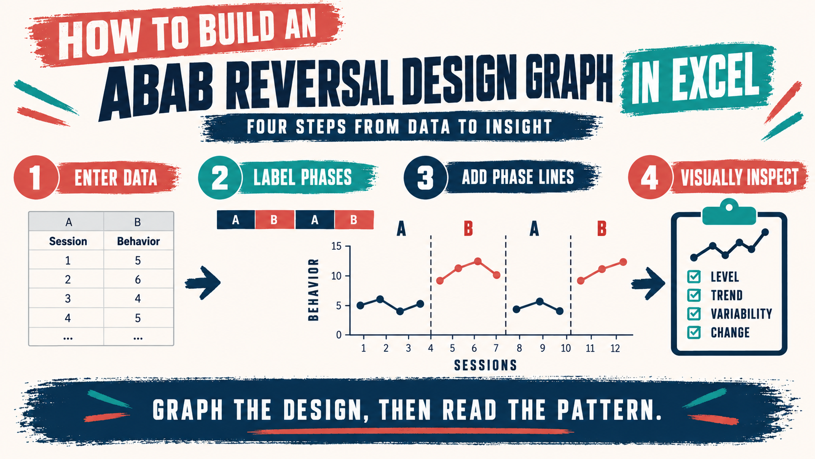
Visual analysis compares the data within and across phases. Start with the level: where are the data points centered in each phase? Then examine trend: are the values rising, falling, or flat? Next check variability: are the points tightly grouped or widely spread? Also look at immediacy of change, overlap between phases, and consistency of the pattern when B is introduced again.
| Feature | Question to ask | Why it matters |
|---|---|---|
| Level | Is the typical value different when the condition changes? | A level shift may show an immediate relation between the phase and the outcome. |
| Trend | Does the direction continue, reverse, or remain stable within a phase? | A pre-existing trend can make a phase change harder to interpret. |
| Variability | Are the values stable enough to compare phases? | High variability can conceal a meaningful pattern or make a small shift look larger. |
| Replication | Does the outcome change again when B returns? | Repeated changes strengthen the experimental argument, assuming the design was appropriate. |
Do not read a graph in isolation. Check whether the measurement system remained consistent, whether implementation was faithful, and whether an outside event could explain the change. A visually attractive ABAB graph can still support a weak conclusion if the phase labels are wrong, the data are unreliable, or a major confound occurred at the same time as the intervention.
When a Reversal Design Does and Does Not Fit
An ABAB design is most defensible when the behavior is reasonably reversible, the intervention can be withdrawn safely, the effect is expected to change within the time available, and returning to baseline will not create unacceptable harm. The target should also be measured consistently and be sensitive to the condition being evaluated.
A reversal may be a poor fit when the behavior change is irreversible, the intervention teaches a durable skill that will not disappear during withdrawal, or withdrawing treatment would expose the person to serious risk. In those cases, a multiple-baseline, changing-criterion, alternating-treatments, or another design may answer the question more ethically. The correct design is the one that balances experimental control with the client’s rights, safety, and meaningful outcomes.
- Good fit clues: reversible behavior, safe withdrawal, stable measurement, and a plausible repeated effect.
- Caution clues: dangerous behavior, essential communication, irreversible learning, strong carryover, or an intervention that cannot ethically be removed.
- Exam rule: Never choose ABAB solely because it offers visual replication; first check whether withdrawal is safe and interpretable.
How the BCBA Exam Tests ABAB Graphs
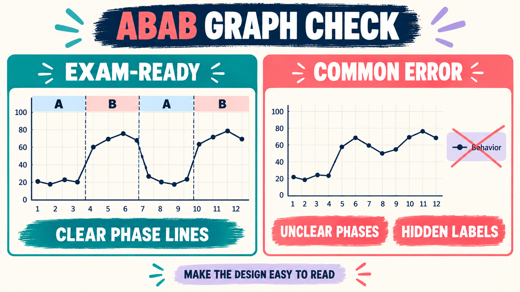
When a question shows an ABAB graph, identify the independent variable and dependent variable before interpreting the pattern. Then compare the A and B phases using the same metric. Ask whether B changes the level, trend, variability, or immediacy of the target response, and whether that change is replicated when B is reintroduced.
Common distractors include calling any four-phase graph ABAB, treating a downward trend as proof of a functional relation without checking phase changes, or assuming that a graph with clean lines proves the intervention caused the outcome. Another distractor uses an inappropriate withdrawal because the target is dangerous or the skill is irreversible. The best answer usually combines visual analysis with ethical and design-fit reasoning.
The current BACB BCBA Test Content Outline is the appropriate authority for exam scope. Use graphing tutorials and Excel examples to learn the mechanics, but use the exam outline and your approved training materials to determine what content to prioritize.
Common Excel Errors When Making an ABAB Graph
- Plotting session number as a second outcome: Remove the session column from the data series while keeping it as the horizontal order.
- Omitting phase labels: A line without A1, B1, A2, and B2 boundaries makes the design difficult to interpret.
- Connecting across a phase incorrectly: Check how helper series and blank cells affect the line between conditions.
- Using decorative 3-D charts: Depth effects and heavy styling can distort level comparisons.
- Leaving axes unnamed: A reader needs the measurement unit and the session or time sequence.
- Changing the data to improve the picture: Correct the graph settings, not the observations.
ABAB Graph in Excel FAQ
What does ABAB stand for in ABA?: It identifies a sequence of two A conditions and two B conditions, commonly baseline, intervention, withdrawal or reversal, and reintroduction. The exact labels must be defined by the design and should not be guessed from color alone.
Is an ABAB graph the same as an ABA graph?: No. An ABA sequence has three phases, while ABAB adds a second B phase. The extra phase can provide replication, but it also raises the question of whether another withdrawal is safe and justified.
Which Excel chart should I use?: A clear two-dimensional line graph with visible markers is usually easier to inspect than a decorative chart. The important features are an ordered data path, readable phase labels, clear phase lines, and named axes—not a particular color or Excel theme.
Does a repeated ABAB pattern prove causation?: It can strengthen evidence for a functional relation when the design is appropriate, measurement is reliable, phase changes are implemented as planned, and alternative explanations are controlled. A graph alone does not prove causation.
Once you can build an ABAB graph in Excel and explain what the phase changes mean, you are ready to practice the more important skill: selecting the strongest answer from the design, data pattern, and ethical context. Try the free BCBA mock exam for more scenario-based practice. For targeted review, use our abab graph excel practice questions to apply the concept in exam-style scenarios.
Take the Free BCBA Mock Exam
When you are ready to apply the idea, use the free practice resource below for additional feedback. Take the Free BCBA Mock Exam